Saturday 11 December 2010

How did you use media technologies in the construction and research, planning and evaluation stages?

To complete this project we used a wide variety of different technologies to create the 3 products. We used more cmplex technologies which enabled us to widen our knowledge and display our creative skills.

Google was used at the start of our project which alowed us to view different film magazine fton covers and film posters. After choosing specific posters and covers on Google images, we used Blogger to upload these images and then analysed each of them.


To analyse existing film trailers we used Youtube. We used the website to search for trailer that were associated with my target audience and my chosen genre for my own trailer.


We used blogger to input all of our our information and to write up my anaylsis of different film magazines, film posters and movie trailers. Blogger enabled me to upload sections of my coursework such as my filming timetable, upload photos of locations that were going to be used during filming and to upload my finished products (film trailer, magazine cover and poster).


We used the programme Adobe Photoshop to enable us to create the magazine front cover, the film poster and the captions within the trailer itself.


A video camera was used for us to shoot all the footage. Along with the camera itself we had a tripod which meant we could take steady shots which was sued for the majority of scenes in our trailer, but we also held the camera by hand for scenes such as the car boot.


We used the program Adobe PremierPro for us to create the actual trailer. All our footage was uploaded to this program, and we were able to choose which clips we wanted and from there we could then edit the selected footage. The timeline allowed us to put the scenes in order, it also enabled us to put the background music alongside the footage.
Using this program proved to be the most challenging as this was the first time any of us had attmepted to use this software. This software was much more complex than the others e.g. photoshop and therefore we had to take some time to get used to the arrangment of the program

What have you learned from your audience feedback?

Trailer- From the audience feedack I learned that our film trailer overall was a success and enticed the target audience to want to go and see the actual film. One of the most successfull components of the trailer was the chosen music, as our audience felt that it captured the mood of the trailer, madde the trailer more dramatic and built up tension, and also the change in the tempo of the usic halfway through the trailer was a favoured featured. People liked the way the footage had been cut in a such a way to ensure it was timed well to the beat of the music. From feedback we gathered that the most favourite part of the trailer was the scene where the hitman attacks a man beside the car and throws him in the car boot, they especially liked the point of view shot when the car boot shuts on the man. The black and white effect also received positive comments as many people felt that this added a dark mood and feel to the trailer accompanied with the music.

Film Poster- The film poster recceived very positive feedback from the majority of those we asked. They felt the poster sold the film very well as all the different aspects of the poster were associated with the film itself by the use of colour, the main image used (edited to black and white) linked the effect used in the trailer, the font style and colour was the same on all products so the audience could easily associate each of them with eachother. The majority of the audience said that the poster we created looked professional as the conventions on already existing published material was used e.g. the layout of the text and the use of them main character in the image which people felt was memorable as we used a medium close up shot of the actor for the photo. Another positive feature on the poster was the fact we had the character posing with the gun which in the trailer itself is the signiture weapon for the main character and people felt this was a good way of linking the two.

Magazine Front Cover- For our magazine front cover we also received very positive comments from the majority of the target audience. People felt it looked professional due to the use of typical conventions of existing material. The colour scheme was well received as many poeple believed it followed the general colour scheme used in the trailer and the poster, and therefore people were easily capable to associate the magazine with the film.
There were not many negative comments on our magazine cover, thoe negative comments were only on minor details and nothing on the major components of the cover. People like the way the PUG was still able to stand out even though we did not use a vibrant colour, and many thought that if we had used a more vibrant colour then it would look out of place and degrade the overall look of the cover. All the conventions were well received such as the barcode, the date and price of the magazine and the layout of text and the image.

How effective is the combination of your main product and ancillary text?

The combination of our media product and ancillary text is very strong and apparent, as we have used the same font style and colour in the captions within our trailer, and the titles on the magazine front cover and poster, therefore the audience is easily able to associate the 3 pieces of material with eachother. The images used for both the poster and magazine front cover are very closely linked to the trailer which enable the viewer to easily tell that all 3 different product are part of the same campaign.


Above are 3 images, one from the poster, one from the magazine cover and the other is a screen shot from a caption within the trailer. The font style and colour in each of these products is exactly the same. By doing this it aids the audience in linking the 2 different pieces of published material and the trailer together.


Above are the 2 main images that were used for the film poster and a screen shot from one of the scnes in the trailer . A link between the 2 images and the screen shot is clear to see and therefore makes it easy for the audience to associate the poster, magazine and trailer with eachother.

Evaluation - In what ways does your media product use develop or challenge conventions of real media products?

Trailer - When creating our film trailer there were a number of conventions from existing Thriller/Action trailers that we have included and represented in our own product. The majority of shots were short and fast paced which gets the audience on the edge of their seat as they concentate on the short clips of action scenes. I wanted my own trailer to represent true action film trailers by following the conventions of what is shown at a particular point in it, for example in most action trailers the main character is introduced almost immediately, however it does not show everything and everyone in the trailer as we want to leave the audience in suspense. One convention of action movie trailers that we did not follow however was the use of dialogue and a voiceover to aid the explantion of the film's story. We believed that it would be better if we did not make use of this as it would make the trailer look gimmcky, and therefore preferred to use captions and let the text help the audience understand the plot of the film, and allow the background music to get the audience exited.
Freytag's triangle displays the structure of a dramatic work such as films. The diagram shows that the film starts off at a slow pace in the exposition part of the triangle, in the rising action the pace quickens and draws the audience in, straight after this is the climax, then the pace of the film slows again before the conclusion. In our trailer we followed Freytag's triangle to a certain extent, however we decided to challenge this convention by not having a falling action after the climax as we did not want to slow the pace of the trailer down as we felt this may bore the audience and they would lose interest in watching the film.
We used captions in our trailer as this is a typical convention for many movie trailers. Earlier in this project we anaylsed the movie trailer for the film Pans Labrynth, and in this trailer, the use of captions were a key element in explaining the general plot of this film. The trailer for Pans Labyrinth also did not make use of any dialogue or commentary, however the use of caption was still very effective and therefore showing that dialogue is not always nessesary, therefore we decided to include this in our own product. Each of our captions consist of the same design and same font style and colour which is a recurring theme in the majority of film trailers. After studying many film trailer we noticed most of them end with a caption displaying the film name or another caption telling the audience of the release date of the film. We chose that we should also end our trailer with this convention as doing this will ensure the film name will stick in the audiences mind as it will be shown if not at the very end of the trailer, near the end.

Film Poster - Our movie poster followes the typical conventions of real media products. We made sure that we included all components that make up a movie poster such as the film title being the biggest piece of text on the page, the actors name/names displayed clearly at the very top of the page, text that included the names of people involved in the creation of the film e.g. director, producer, film editor etc, the release date of the film clearly displayed. The main image used for the poster is of the main character from the film, this is seen in the majority of film magazines as this entices the audience to see the film if they see a popular actor playing a main part in a film. The main image consists of a medium close up of the main character looking straight at the camera so that it draws the audience's attention to the poster, the majority of real advertising material uses this and we did not want to challenge this convention. As our movie trailer has been edited to create a black and white effect, I decided that the image used on the advertising poster should also be in black and white so that the audience will clearly be able to associate the poster with the film trailer.
We ensured that the font style and colour used on our trailer was the same as what was used for our magazine front page and the font style used on our captions within our trailer itself.

Film magazine
We used typical conventions of a film magazine front cover on our own product. We had a skyline at the very top of the page inside a grey border. The masthead was placed centrally at the top of the page just under the skyline, this is generally the largest piece of text on the page as this is meant to stand out to the audience, therefore we felt is nessecary to follow this convention. we also noticed while analysing magazine front covers that the magazine name normally stetches across the width of the page, this convention was also taken into account and used in our product. Sub-stories/coverlines were situated down the left hand side of the page and are of significantly smaller font which displays their lesser importance compared to the main story which the magazine is covering. The use of a PUG, barcode, date and price were also other conventional features which we felt had to be included on our front cover and as seen on many magazine front covers are all position and designed to be more discrete to ensure that the audience is not automatically drawn to these features.


Wednesday 8 December 2010

Judgement Film Trailer

Audience Feedback

Once we had completed the trailer we showed the finished product to various people in our sixth form and asked for their opinions on it. We decied that we would ask 3 males and 3 females for their opinions.

  1. That trailer was amazing. I loved the different types of shots and camera angles, especially the scene with the car boot.
  2. The music used for your trailer was very appropriate, the scenes were cut very well so that the music and the clips were in sync.
  3. This trailer looks very professional, one of the best i've seen.
  4. The main actor in your trailer was brilliant, played the part excellently.
  5. Loved the music, made the trailer very dramatic.
  6. I liked the way you edited your trailer to make the black and white effect to the scenes, very professional.

Wednesday 17 November 2010

The Editing Process


Now that we have completed all of our filming, we now needed to edit the material to create our movie trailer. To do this we used the programme Adobe Premier Pro Cs4. At first this programme looked very complex and difficult to use, however with some help at school we were able to get to grips with it and start the editing process. Throughout this process we will listen to different opinions making sure that our trailer flows well and appeal to our target audience.


The editing process consists of:
1. Uploading every piece of footage we have filmed onto the programme by clicking file, then import, and then selecting the folder that contained our files of our footage .

Our files then appeared on the panel on the left hand side in the order that the footage was recorded .We then went through each piece of material and decide upon which scenes will be definately used in the final trailer.


One of the most important tools that we used while editing our footage was the Razor tool. This was used to cut up each piece of footage to allow to put in different effects such as flash effects for the gun, also this was used to create jump cuts, and finally this tool enabled us to shorten clips.


2. Use our storyboard and put the pieces of footage in order in the timeline.


3. By using the cut and place tools we are able to alter the length of each scene.
4. Importing the chosen background music, altering the pace of the song to ensure that the scenes would fit the timing of the beat of the music.
5. Importing created captions and placing them at specific places on the timeline where they would fit in well.

Editing techniques:
1. Flashes during/in between certain scenes
2. Cuts, jump cuts

Magazine front cover initial designs


Scene re-shoot list

Film Trailer Final Detailed Storyboard


Monday 15 November 2010

Filming Schedule

We constructed a filming schedule which enabled us to shoot our shootage quicker and more efficiently. In this schedule we included the time and date filming would commence, actors that would be present at a particular scene and also the locations that will be used. Our filming took placed between Tuesday 9th November and Saturday 13th November.

Tuesday 9th November:
Location - School grounds
Actors - Anthony Kapas, Josh Cuncarr, Michael Grayston
Time - 10:00am - 12:30pm


Wednesday 10th November:
Locations - School grounds, Anthony's House,
Actors - Anthony Kapas, Josh Cuncarr, Michael Grayston
Time - 9:30am - 1:00pm

Friday 12th November:
Locations - Underpass outside school, School Carpark
Actors - Anthony Kapas, Stefano Santos, Steven Bonito
Time - 11:00am - 1:00pm

Saturday 13th November:
We plan to re-shoot any scenes we feel are not quite right
Locations - TBD
Actors - TBD
Time - TBD

Friday 29 October 2010

Target Audience

When deciding upon what type of audience I was going to target my film trailer towards there were a few factors I had to consider. Firstly as my trailer is for a Thriller/Action movie we had to decide upon what sort age range are we targeting for and also what gender. We felt as the trailer contains violence e.g. killing scenes that the age range would be between teenagers 17 years old, to people in their late 20s. We also felt that the majority of the people we would be targeting for would be males in these age ranges as it is these who are most attracted to these films e.g. The Transporter. Our age range was decided alogside the fact that the majority of Thriller/Action films are usually of an age rating of 15 or 18, and therefore we need to be able to make our trailer appealing to those who are legally able to see it. As we have opted for targeting this specific audience we feel that we have to represent this in our trailer by using actors of a similar age range.

Thursday 28 October 2010

Final ideas for Trailer

Camera Angles

Throughout our trailer we will be using a wide variety of different types of shots and camera angles while shooting our footage, this is because we want to be able to display the mood and emotions during different scenes. If a variety of shots and camera angles are not used then it is clear that the moajity of scenes would not look dynamic and would end up looking very similar and the end result would be a boring looking movie trailer.

Shots that will be used during filming:
1. High Angled shot - This will be used to make a specific character in the film to maybe look inferior and helpless. The high angle shot will be used a lot during fight scenes and/or in the build up to action sequences.
2. Low Angled shot - This type of shot will be used to make it apparent to the audience which character has more power and is in control. This shot much like the high angle shot will also be used in the build up of actions sequences and/or during fight scenes.
3. Long shots - The long shot will be used at times where we need to show the whole of a characters body so that the environment that character is in can be easily identified as well as being able to see the movement of the character.
4. Medium close up - This shot will be used in scenes where we want to be able to see the emotion on the characters face through the expressions on their face e.g. anger, shock, cynicism etc. Although this shot is prodominantly used to display the characters emotion we are able to see their face down to the top of their chest, and therefore we are able to distinguish the environment they find themselves in.

Editing
As my film trailer is of a Thriller/Action genre, there are a number of different techniques that i will use while editing to ensure that it fits in with the typical conventions of a Thriller/Action style film trailer. The techniques that i will use include the cuts between scenes, the transitions and order of the footage taken.

1. Jump cut

Mise-en-scene

Props:
For our movie trailer there won't be very many props needed, but the ones we do need will be significant components for what we want and need in our scenes. The props we will be using are a gun, knife and a car. The gun and knife are needed as weapons for the main character to murder others with in our trailer, and the car will be needed for our planned fight scene as we plan to use the car boot.

Actors:
In our trailer there are 3 casted actors, all of which are male. One male protagonist, and 2 male antagonists.

Initial Ideas for own video

While constructing our own movie trailer the use of camera, editing, sound effect/music, setting, dialogue and mise-en-scene will all be taken into consideration.

Camera Angles:
Different camera angles are an important factor while shooting footage for our movie trailer. For the most part we will use a tripod to ensure that in certain scenes the footage taken is not shaky and only in a couple of scene will we use the camera without the tripod deliberatly so that we had a handheld effect.
We will try to ensure that we used low angle shots at times for the main character giving the impression of authority and power, and we will also use the opposite effect by using a high angle shot on certain characters that are victims, giving the impression of vunerability.
We do not predict to use many close ups in our footage, however some medium shots, and medium close ups of the main character will be attempted as these shots will enable us to see the different expressions and emotion on the protagonists face e.g. anger and cynicism.

Editing:
At the beginning of our movie trailer we have decided that it should start off at a medium pace due to the genre of the film (Thriller/Action), and half way through we will attempt to quicken the pace of the trailer by use of quicker cuts between scenes as we feel it will give a greater feeling of exitement as quicker cuts can make the trailer look more dramatic.
Captions will be used in the first half of the trailer to tell the audience some background information and give a general overview of what the story of the film is about, however we will make sure that by using the captions we do not give too much of the plot away. When inputting the captions we have decided that we will not use transitions e.g. fade in/out to go from scenes to captions as we believe this would significantly slow down the pace of the trailer and will not fit in with the theme of the film.
While editing we also have to make sure that we get the timing of the music and the timing of scenes being displayed in syncronisation as best we can otherwise it will not create the desired effect on the viewer. We also intend on using the black and white effect while editing as this will give a darker feel to the film.

Music:
We have decided that for our trailer to work we must use fast paced music to aid a dramatic effect that a Thriller/Action usually presents, therefore we have chosen to use a song called 'Siege Towers' by the artist Audiomachine, this was decided as we felt this song would make a big impact on the audience due to its dramatic beats, climaxes and we felt the pace of the song coincided well with our film. Also after anaylsing some action film trailers we noticed that there are 2 or maybe 3 different background songs used which is often done to change the mood and pace of the trailer, therefore we feel we will need to do this.

Sound effects
There will be very few sound effects used within our trailer as most of the impact is expected to be made from the background music itself e.g. the beat and tempo changes .For one of the sound effects we plan to use a heartbeat sound effect near the end and also there will be gunshot sound effects at certain points during the trailer.

Setting :
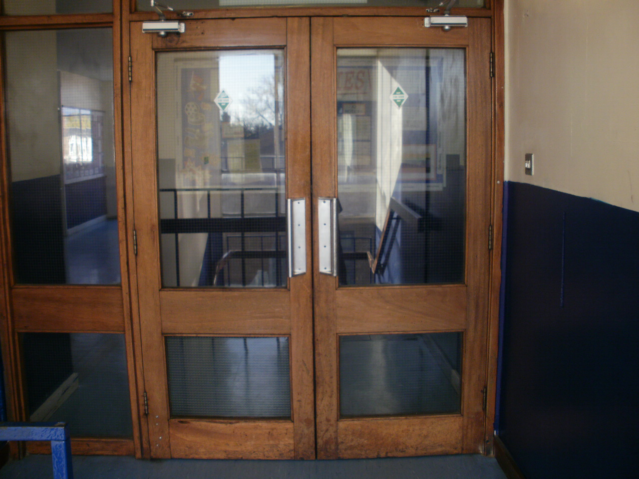
Most of the footage filmed will be on school grounds as there are a variety of different rooms and locations within the ground we can use. We also plan to use locations outside of the school grounds for example an underpass, carpark and another house.

Dialogue:
For our trailer we have decided against using dialogue throughout and have opted to settle with just using the captions to give some information as we believe by using dialogue it would take away the dramatic feel of the trailer and that the music and footage alone would portray the theme of the film in a significant way.

Mise-En-Scene:
The Mise-En-Scene is an important factor in creating our trailer. The clothing of the main character (suit, black leather gloves) shows his importance in the film and gives the impression of a professional killer. Other characters will also be wearing suits and this is done deliberatly as this shows that the protagonist's victims are business like and serve a purpose rather than just having the victims dress in casual clothing as this may just show that the main character is targeting them for no reason.

Wednesday 27 October 2010

Film poster analysis 3


In this movie poster for the film 'Resident Evil' the main colours used are red and black, the red coincides with the red coloured dress that the main character wears in the actual film, and therefore follows the general theme.
The main image for the poster consists of the main character okayed by actress Milli Jovovic and another female character played by Michelle Rodriguez. Both are looking directly at the camera, Millia Jovovic is standing face on towards the camera, holding a gun in one hand, which tells the audience that she plays a significant part in the fight scenes. The other actress Michelle Rodriguez appears to be standing behind Jovovic and has her back turned, this could give the impression that she has a hidden agenda, and that during the film she could turn allegiances. Milia Jovovic is wearing a red dress which is her signature outfit that her character wears throughout the film, and therefore this links the published material to the film. This is also the case for the other actress as she is wearing the same outfit on the poster as she does in the actual film.
The names of the actresses are placed at the very top of the page highlighted in white which makes it stand out on the dark coloured background of the main image.
The name of the film is positioned near the top of the page, just under the names of the actresses but just above the heads of the characters in the main image, this is highlighted with 2 different colours (white, with tints of red), this follows the general colour scheme and stands out well to the audience s this is the largest piece of text on the page. The film slogan is positioned just below the image of the characters to ensure that it is not obstructive. This is highlighted in white which makes it clearly visable to the audience even though it is significantly smaller than the name. The block of text which includes the names of people involved in the creation of the film is situated below the slogan, the font size for this is quite small as it is not meant to draw the readers attention to it immediately, however with it being highlighted in white people are still able to read it.
The official website linked to the film is seen at the very bottom of the page and is highlighted in red to continue the colour scheme.

Film poster analysis 2


In this movie poster for the film 'Transporter 3' 3 main colours are used (White, Black and blue, these colours are used for both the main image and the font colour for every piece of text on the poster.
The main image used for the poster is of the main character played by actor Jason Statham shown as if he is in mid air during a fight scene while holding his trademark weapons. The image of him is displayed in black and white however there is an image of a woman which is in colour, this gives the poster a more modern look but more importantly it tells the audience that this woman has a major role in the film. The main image also consists of Jason Stathams trademark car during the film.

The main actors name is positioned at the very top of the poster and is highlighted in blue. The size of the font for this is not very big however with it being in blue it is able to stand out on the white background.
The film name is positioned in the centre of the page and has been made significantly larger than any other piece of text on the poster. This is highlighted in white and is able to stand out to the audience as it is placed on top of the black suit of the actor. The film slogan is situated just above the film name and has been reduced in size significantly deliberately as it is not meant to stand out to the audience.
Text consisting of the names of people involved in creating the film are placed underneath the film name. The font for this is very small as it is not meant to stand out and is highlighted in white.

Film poster analysis 1


In this poster for the movie 'Hitman' 3 main colours are used (Black, red and white), this coincides with the general colours the main character wears (black suit, white shirt and red tie). By the woman in the background also wearing a red dress it shows a link between her and the main character of the film, giving the audience the impression of her either being a love interest to the Hitman or being a danger to him due to her being positioned more in the background looking at him which could tell the audience that she might be working behind his back. The main image of the hitman displays him directly looking out into the audience with a slightly evil/cinister smile. He is wearing his trademark outfit which is a black suit, white shirt and red tie and is also posing with a silver gun which tells the audience that this weapon will play an important part in the film.

The film name 'Hitman' is displayed about three quarters down the page. This is the largest piece of text on the poster which is done deliberatly so that it stands out to the public and they can quickly and easily see the name of the film even if they are only glancing at it while passing by. This text is also highlighted in red which follows the genral colour scheme.
Information including names of directors, producers, companies involved in the film and actors are positioned under the film name. The font for this information is the smallest on the page as it is not meant to stand out and grab the audiences attention. This is highlighted in white.
The release date of the film is situated underneath and is highlighted in red, and is the second largest sized piece of text on the poster and therefore the viewer can easily see when the film is due to be released.
Finally the website which is linked to the film is positioned at the very bottom of the page and is the second smallest sized font on the page again done deliberatly to make it discrete.

Film magazine front cover analysis 3


This film magazine front cover consists of 3 main colours (blue, white and yellow) for the general colour scheme for this issue of the magazine. These colours are used for the main image and the font colours for pieces of text. These contrasting colours are used to ensure that both the main image and every piece of text can be easily identified.

The name of the magazine 'Empire' is placed at the very top of the page and spreads across the entire width of the front page. The font colour for this is a deep red, this is the film magazine names trademark colour and also allows it to stand out from the contrasting background, Empire is also in block capitals. This piece of text is layered on top of the models head, the publishers were happy to do this as Empire magazine is already a well established film magazine name and this did not prevent the reader from clearly seeing the models face therefore there was no risk taken by slightly obstructing part of the image.

The main title for the main story the magazine is covering is situated under the Empire name on the left hand side of the page. This font is highlighted in white therefore and therefore can be easily read as it contrasts with the dark blue background. This piece of text is all in capitals and is the second largest piece of text on the front page.
Other sub stories have been placed down the left hand side of the page under the main story. The sub stories are significantly smaller in size than that of the main story font size which therefore makes it apparent which is the most important/ most covered story inside the magazine. The sub stories are highlighted in a white/grey font colour, however it is still clearly visible and easy for the reader to scan the information on the page. A quote from Harry Potter is placed on the right hand side of the page, and the colour of the text alternates between white and yellow. The quote is slightly larger than the sub stories which clearly shows that it is related to the main story. Three film names are placed at the bottom of the page, two names are highlighted in white, the other in yellow.
The film magazine website address is seen on the right hand side of the page just underneath the name Empire. This is the second smallest piece of text visible on the cover, however it is highlighted in red and contrasts with the dark coloured background which allows the reader the pick out the information with ease.
The magazine issue number and price is placed towards the left of the page in the middle of the letter 'M' in 'Empire'. This is the smallest piece of text on the page as it is not meant to stand out significantly and grab the readers attention immediately, but as it is highlighted in white it can still easily be seen and read.

The main image of the front cover displays Harry Potter. We are shown a medium shot of the character as he looks directly at the camera which immediately draws the readers attention to him, and the audience will therefore instantly know what and who the magazine story is covering. The dress code is appropriate as his red jacket and white and blue shirt follow the general colour scheme of the magazine, he is also wearing the characters trademark glasses.

The barcode is placed near the bottom of the page on the right hand side, this is clever as it blends a little into the bright background colour and is situated in a discrete section of the page therefore the reader will not be drawn to the barcode and the price of the magazine will not be the first thing that comes to mind at first glance.

Film magazine front cover analysis 2


This film magazine front cover consists of 3 main colours for the main colour scheme (blue, white and black), these colours are used for both the main image and the font colour for titles and sub stories. Black and white are used for the majority of the text on the page, this is so it can be easily read on the blue background colour in the main image.

The name of the magazine 'Empire' is placed relatively near the top of the page and spreads across the entire width of the front page. The font colour for this is a deep red, this is the film magazine names trademark colour and also allows it to stand out from the contrasting background, Empire is also in block capitals. This piece of text is layered behind the models head, the publishers were happy to do this as Empire magazine is already a well established film magazine name therefore there was no risk taken by slightly obstructing part of the text. A gap above this is left so that a skyline can be input. The main title for the main story is placed underneath the magazine name and situated to the left of the page and of the models body. We can see that the title is layered on top of the main image but only a small amount of it covers part of the model. The font for the main title is highlighted in white which can be read relatively easily. With each word of the title the font size gets slightly smaller, 'X-Men' is the biggest sized font of the title and therefore will grab the readers attention as they can see straight away what film is being covered by the magazine as their main story.
Other smaller stories are placed below the main title down the left hand side of the page and on the right hand side. The font size for these smaller stories is significantly smaller than for the main story which emphasizes the importance of the X men review. The font colour alternates between white and black which allow the reader to easily scan through pieces of information quickly. Also the sub stories which are highlighted in white have been made slightly transparent as the opacity level has been lowered, but the text is still clear to see. All of the titles and sub - stories are in capitals and in basic font which also makes it clear to the reader what the magazine will consist of.
The film magazine website address is placed just underneath the magazine name on the right hand side of the page, this is highlighted in white. The font size for the address is the second smallest on the front cover as it is not meant to stand out and make the reader notice it straight away. The magazine issue number and price is placed towards the left of the page in the middle of the letter 'M' in 'Empire'. This is the smallest piece of text on the page as it is not meant to stand out significantly and grab the readers attention immediately, but as it is highlighted in white it can still easily be seen and read.

The main image for the cover is of X men character Wolverine. The image displays three quarters of his body while he is standing, he is not looking directly at the camera but is looking above as if he is looking into the distance. He is wearing a white vest, and blue jeans, this colour combination is appropriate as it follows the main colour scheme of the magazine (white, black and blue).

The barcode is placed near the bottom of the page on the right hand side, this is clever as it blends a little into the bright background colour and is situated in a discrete section of the page therefore the reader will not be drawn to the barcode and the price of the magazine will not be the first thing that comes to mind at first glance.

Film magazine front cover analysis 1


This front cover consists of quite a variety of different, contrasting colours. Quite dark colours are used for the main image (black, dark green and blue for the clothes used on the model. The colour of the text on this page contrasts with the main image with the use of bright green, white, purple and red, these colours are used for the text to ensure that they stand out from the main image and grap the readers attention.

The name of the magazine 'Empire'is placed relatively near the top of the page and spreads across the entire width of the cover. The text for this is highlighted in deep red which makes it stand out from the dark background and is in block capitals. This piece of text is layed behind the models head, the publishers were happy to do this as Empire magazine is already a well established film magazine name therefore there was no risk taken by slighty obstructing part of the text. A gap above this is left so that a skyline can be input.
The main title for the main story is placed underneath the magazine name and situated to the left of the page and of the model so that his face is not obscured. The fist 2 words for this is highlighted in purple, the next word 'Joker' is in bright green and has been made significantly bigger than the rest of the title to emphasize the name, the rest of the title is highlighted in white and has been reduced in size.This title has been layered in front of the main image but only covers part of the models upper body so not too much is obstructed.
Other sub-stories are situated on the right hand side of the page towards the bottom. The majority of the text for the sub-stories is highlighed in white which makes it easy for the reader to scan over the text as it contrasts with the dark coloured background of the main image however a few words are in light green which is to follow the general colour scheme on the rest of the magazine and also to emphasize these words and make them stand out more to the audience, the light green also allows the text to be easily read. The size of the text for the sub-stories is significantly smaller than the magazine name and the main story title.
The film magazine website address is placed just underneath the magazine name 'Empire' to the right of the page, this is the smallest piece of text on the page as it is not meant to stand out significantly and grab the readers attention immediatly, but as it is highlighted in red it can still easily be seen and read.

The main image for the cover of the magazine is of 'The Joker', a character in the film 'The Dark Knight'. He is wearing a purple, longsleeve shirt with a green waistcoat and purple tie, also purple trousers, green and purple socks and brown shoes. This dress code is appropriate as it follows the main colour scheme of the magazine cover (green, purple, white. The image is of the Jokers whole body sitting down looking straight at the camera, which would instantly interact with the audience.

The barcode is placed in the bottom left hand corner of the page. This is situated here as it is not supposed to stand out to the audience, this is a clever idea as the price of the magazine will not immediatly enter the readers mind.

Thursday 21 October 2010

Detailed Analysis - Hitman


The official trailer for Hitman lasts a total 2 minutes and 17 seconds long.
The first thing to appear to the audience is the '20th century Fox' logo, this lasts on screen for about 5 seconds and then a flash transition. The first series of clips in the trailer are short takes and consists of faded transitions, at this point we hear slow background music and dialogue of the narrator. This changes 20 seconds into the trailer where a fight scene is shown and quick cuts are used, although the tempo of the trailer does not really increase as the background music is still slow.
The background music changes 26 seconds in assisting a flash transition to signify a change in the mood, there is not much music but just a low beat so that we can clearly hear the dialogue as it is important and which signifies the rising action. In the next series of clips the tempo alternates due to the use of quickly cut scenes, slow faded transitions and editing of a clip into slow motion.
At 37 seconds we get another flashed transition, this is accompanied by faster background music, and shorter clips which are quickly cut to quicken the tempo of the trailer. Captions start to be used half way through which consist of medium sized text highlighted in white and a large logo placed on a plain black background, the logo and text on the caption slowly move away.

Thursday 7 October 2010

Detailed analysis - The hills have eyes


The official trailer for The Hills have Eye is a total of 2 minutes and 36 seconds long.
The first screen to appear on screen is the MPAA ( Motion Picture Association of America), informing the audience of the film certificate.
The 'Fox Pictures' logo is next to appear on screen, this fades in and is on screen for about 3 seconds, while this is on screen a background sound of a siren is heard in the background, a quick transition from this to an actual clip from the film takes place while the sound of the siren is continuing.
A couple of clips are shown, then a caption which consists of a plain black background with small white font appears on screen , another series of film clips of a nuclear bomb exploding is shown while being quickly cut, followed by another caption. This goes on until 28 seconds into the trailer.
The next few clips to be shown is of a group of people on a road trip, at this point the clips shown take place during the day, the background music is quite upbeat giving a feel of normality and joy, other sounds that the audience hear is the dialogue from the characters. Each clip o far lasts about 2 or 3 seconds on screen and is cut to the next clip. Towards the end of this series of clips a faded transition to the last clip is used showing a stranger talking to them i the car which tells the audience that this section is important, this is followed by a transition like a film reel which has run out.
In the next series of clips, we are shown the group of people continuing on their road trip, but now there is no background music and we just here the sound of the car engine until the car crash. Now we see them out of the car and then a shot which makes us think someone is watching them is shown. At this point the cuts between clips get quicker and more frequent, this shows that the characters are now vulnerable, and in the background we hear a sound effect of a heartbeat which has an effect on the audience watching as it tries to make the viewers heart rate rise. The clips of the film are now in darker environments, and with the quick transitions the audience can't clearly see yet what is attacking them, until a close up of creature quickly turning round is shown. The heartbeat sound effect now stops and all that is heard is heavy breathing, at this point the audience are anticipating that something big is about to happen. The next series of clips are very short with flickering transitions to make the viewer feel disillusioned and uncomfortable.
2 minutes 13 seconds in the film name appears on a black background, the text fades onto screen for a few seconds then fades out again, while this is on screen we hear the background sound of a woman breathing heavily in fear, and the creatures laughter. The caption fades out and we see another clip from the film of a hand on the womans face for a few seconds. Next another capion fades onto screen with the films slogan of ' The lucky ones die first', a faded transition takes place to another caption which consists of the names of the cast, crew and producers, 'coming soon' and the film website at the bottom.

Monday 4 October 2010

Detailed Analysis - Dawn of the Dead 2004

http://www.youtube.com/watch?v=8LUzJAsa-gg

The official trailer for the 2004 remake of Dawn of the Dead is a total of 2 minutes and 30 seconds long.
The first screen to appear to the audience is the MPAA (Motion Picture Association of America), informing the audience the film certificate has been approved of.
Next we see the logo of the major movie studio 'Universal Pictures' fade in, this stays on screen for just over a second and then fades out. Straight after the film company logo of Strike Entertainment fades quickly into view for a second and then a faded transition from this to the start of a clip from the film begins.
At the start clips from the film are accompanied by slow music to give the feel of happiness and normality as we see the woman talking to her daughter in the driveway. In these series of clips there are slow, faded transitions which give a feel of calmness. Captions are used to inform the audience what time of the day these clips are taking place e.g. 'evening', these captions consist of a plain black background and medium sized white font.24 seoncds into the trailer we get another caption but now the music tone changes to a lower note telling the audience that something is about to happen, straight away were here the sound effect of a ticking clock and now the is no background music. Now there are no transitions between clips at this point and they are just quick cuts which coincide with the rising action as we see a blurred image of the daughter in the doorway. on 42 seconds we see and hear the dad scream as he is being attacked by the daughter, the next few series of clips are now accompanied by a piercing sound effect, cuts between these clips increasingly get quicker.
On 52 seconds the pace slows down again as the woman stands in the driveway looking arounds her, we here slow and low toned music and heavy breathing. Now more captions appear, but the now the font has changed slightly, and when the caption fades into picture we there is a sound effect to accompany it to give the audience a feel of danger.
In the next few clips the piercing sound effect returns and close up shots of the main characters are shown and quickly cut, this then fades out. 1 mnute and 20 seconds into the trailer clips appear for a second and then cut to a black screen accompanied by stuttering music. As the music get louder and more intense the clips shown get shorter and cuts are quicker and more frequent which tells the audience thigs are getting worse.
2 minutes and 15 seoonds in a white screen appears blankly but then arms and hands are shown rubbing up against the screen as if it were people trying to get into a building and makes the viewers feel uncomfortable because it looks as though they are trying to ge to the audience, this lasts for 5 seconds. This is done as this image will be remebered by the audience due to the last few images being what they remember most.
The film logo flashes onto the screen, and this will be linked to other publicity material such as posters and billboards that advertise this film. The next caption has a plain black background and white text and consists of the names of producers and oher people working on the film. The final caption flashes onto the screen like the film logo and consist of the text 'Coming Soon' which leaves the audience in suspense.

Thursday 23 September 2010

Detailed Analysis - The Descent

The official trailer for The Descent is 2 minutes and 5 seconds long.
The first screen the audience see is the MPAA (Motion Picture Association of America) a green background with white font telling the audience the film certificate), in this case it is rated R.
The next screen that appears is the film company logo 'Lionsgate', this screen fades in and stays on screen for about 2 seconds and quickly cuts.
Now actual scenes from the film are shown without any background music, the only sounds that can be heard is the dialogue by the characters and sound effects during the transitions. In these first few scenes the setting is being set, the main characters are being revealed and there is the use of long ad medium shots. At this stage the clips shown are in the daytime which gives a feeling of happiness and normality where a group of friends are in the middle of their road trip to somewhere.
The turning point in the trailer comes 25 seconds into it there is a loud sound effect to go along with the transition where the characters now go down into the cave. The scenes here get significantly darker and there a more close up shots of the girls making there way through the cave, there is only a small amount of light which is supplied by their flashlights. Between these scenes are a series of captions that consist of only a plain black background and small white font which fades in and is slightly blurry which coincides with the fact that they cannot see much down in the cave and there is only a small amount of light that their flashlight produces. The small font on the captions is done deliberately to increase the feel of claustrophobia, making the audience feel just as uncomfortable as the characters. Background music is still not used in these clips and the only sounds are the dialogue and heavy breathing. The duration of the clips is extended as the dialogue is an important factor for the audience to understand what is going on as they cannot see what is going on.
In the next caption a sound effect goes with it when the text fades onto the screen to give the impression that something bad is about to happen. In the next film clip the scene is being shown by a handheld camera which is being used by one of the characters, the creature is then revealed standing behind them, a sound effect goes with this to mark the start of the action.
In one of the next series of clips it shows a flashlight being dropped and the light from it going out showing things are getting worse. As more clips from the film are shown, short quotes from newpapers or magazines appear over the footage of the film. Now the scenes are quickly cut whereas at the start of the trailer there were slow faded transitions.
The last few clips shown bring the trailer to a cli max which relates to Freytag's triangle, these last few images have to be memorable and stick in the audiences mind and the last part will be what they remember most.
At the very end there is a last caption with text saying 'coming soon' which leaves the audience in suspense and gives them a general idea of when the film is expected to be released. Underneath this text is the official website address linked to the film.

Monday 2 August 2010

Freytag's Pyramid


According to Freytag, a drama is divided into five parts, or acts, which some refer to as a dramatic arc: exposition, rising action, climax, falling action, and dénouement. Although Freytag's analysis of dramatic structure is based on five-act plays, it can be applied (sometimes in a modified manner) to short stories and novels as well.

Exposition -
The exposition provides the background information needed to properly understand the story, such as the protagonist, the antagonist, the basic conflict, and the setting. It ends with the inciting moment, which is the incident without which there would be no story.

Rising Action
During rising action, the basic internal conflict is complicated by the introduction of related secondary conflicts, including various obstacles that frustrate the protagonist's attempt to reach his goal. Secondary conflicts can include adversaries of lesser importance than the story’s antagonist, who may work with the antagonist or separately, by and for themselves or actions unknown.

Climax
This marks a change, for the better or the worse, in the protagonist’s affairs. If the story is a comedy, things will have gone badly for the protagonist up to this point; now, the tide, so to speak, will turn, and things will begin to go well for him or her. If the story is a tragedy, the opposite state of affairs will ensue, with things going from good to bad for the protagonist.

Falling Action
This is the moment of reversal after the climax, the conflict between the protagonist and the antagonist unravels, with the protagonist winning or losing against the antagonist. The falling action might contain a moment of final suspense, during which the final outcome of the conflict is in doubt. Which is also the outcome of what happened in the rising action and the climax. Summary: The falling action is that part of the story were the main part (the climax) has finished and you're heading to the conclusion.

Dénouement, resolution, or catastrophe
This comprises events between the falling action and the actual end of the drama or narrative and thus serves as the conclusion of the story. Conflicts are resolved, creating normality for the characters and a sense of catharsis, or release of tension and anxiety, for the reader. Etymologically, the French word dénouement is derived from the Old French word denoer, "to untie", and from nodus, Latin for "knot." Simply put, dénouement is the unraveling or untying of the complexities of a plot.